

LILI HONEY
Have you ever ends up buying something just because of the look, especially the packaging, and not that you need it. Well, it happened all the time for me. I always looking for great packaging on store shelves, and this Honey grabs my attention that it could have a better design to shine in stores.
So I started to redesign the brand logo with new packaging, still in working progress. Lili Honey is an Organic Honey from a California farm. They have few flavors with few packaging.
How cool would be when I propose them this new Logo and Packaging and they like and go with my design...
“Dream Big, Work Hard, Make it Happen”
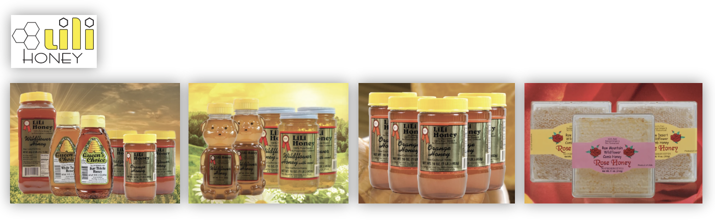
Original logo and Packaging
New Concepts for Logo
The Honey is from a Local Farm in California, and It’s Organic, Raw, and Unfiltered.
Here are some logo sketches that I come up with. An object that I used for the logo is; Honey dipper, bee, Honeycomb, flower, lily flower, simple leaves. The typography will be hand lettering, script, or simple sanserif.

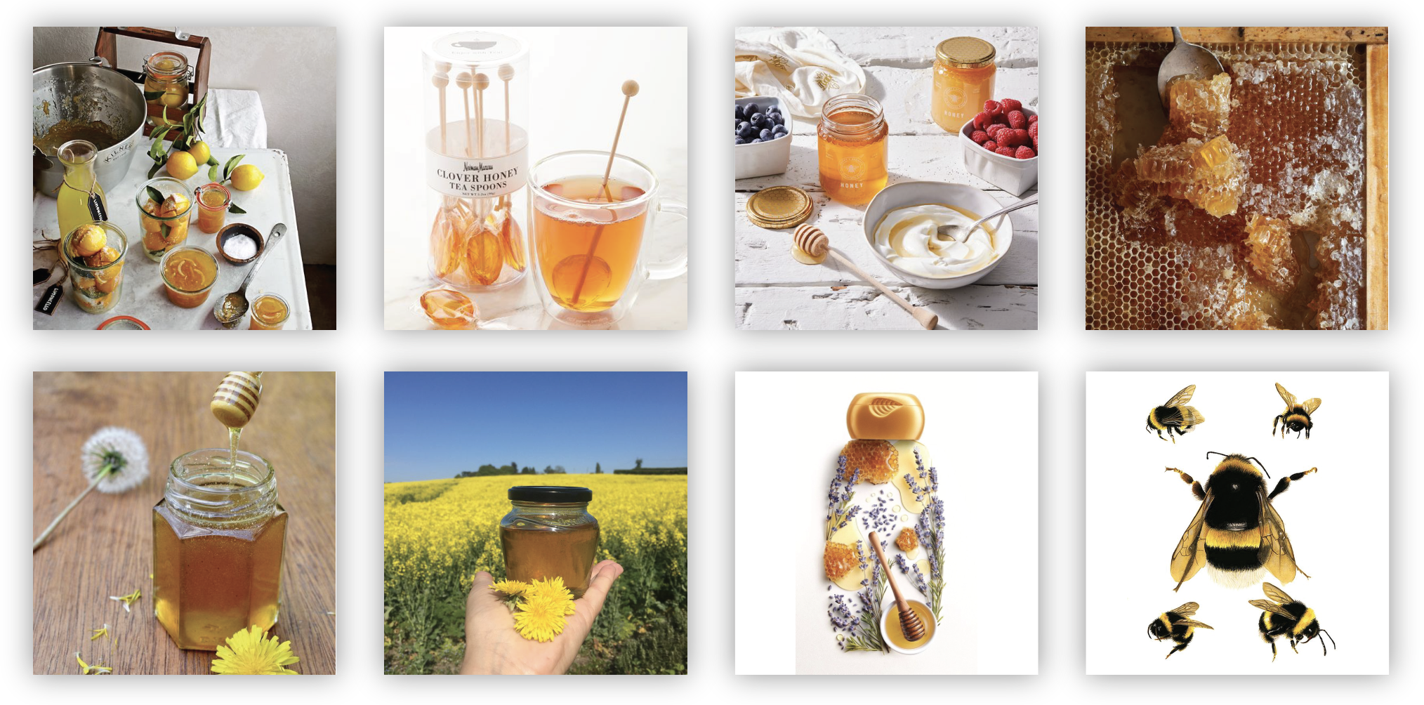
Color Inspiration
New Logo Study
After some sketches and ideas for Lili Honey, I choose some of them that are more related to the way that they produce the honey on-farm at Sunny California; being Organic, Raw, and Unfiltered.
Color Study

Logos

Logo Development
I choose one of the logos which I thought is more relative to the brand, but I want to develop more.
Logo Chose to Develop More

Developed Logos

Final Logo

Packaging Concepts
The original packaging for Lili Honey is Cylinder, Bear bottles, or Rectangular flat packaging for honeycomb products.
Lili honey is an organic Honey directly from a California farm. The packaging for this honey would be an organic look so I decided to go with a round shape.

